Nucleus Icons
Since 2017
Technology
Product Design
Making Complex Ideas Visual
Nucleus Icons
Since 2017
Technology
Product Design
Making Complex Ideas Visual
Nucleus Icons
Since 2017
Technology
Product Design
Making Complex Ideas Visual
Back in 2017 there was a gap within the design world. We were seeing the first signs of a new technological shift: AI was starting to show its potential, VR and AR were emerging from research labs, blockchain was beginning to disrupt industries. But when it came to finding icons that captured these ideas, designers were stuck with generic symbols that didn’t reflect what these technologies actually meant. The problem went beyond emerging tech. Sales and marketing teams needed icons that showed real workflows, not just generic briefcases and megaphones. Design researchers lacked visual language for their specific methodologies. Across different fields, from technology to business and research practices, people were looking for something in between simple icons and complex illustrations. They wanted visuals that could represent ideas like "conversational AI," "lead nurturing," or "heuristic evaluation," while still being clean and scalable. Existing libraries couldn’t keep up with how quickly work was changing. That’s when we saw an opportunity to build something new - a visual language that could make complex ideas, whether emerging technology, business processes or research methodologies, easier to understand.
Back in 2017 there was a gap within the design world. We were seeing the first signs of a new technological shift: AI was starting to show its potential, VR and AR were emerging from research labs, blockchain was beginning to disrupt industries. But when it came to finding icons that captured these ideas, designers were stuck with generic symbols that didn’t reflect what these technologies actually meant. The problem went beyond emerging tech. Sales and marketing teams needed icons that showed real workflows, not just generic briefcases and megaphones. Design researchers lacked visual language for their specific methodologies. Across different fields, from technology to business and research practices, people were looking for something in between simple icons and complex illustrations. They wanted visuals that could represent ideas like "conversational AI," "lead nurturing," or "heuristic evaluation," while still being clean and scalable. Existing libraries couldn’t keep up with how quickly work was changing. That’s when we saw an opportunity to build something new - a visual language that could make complex ideas, whether emerging technology, business processes or research methodologies, easier to understand.
Back in 2017 there was a gap within the design world. We were seeing the first signs of a new technological shift: AI was starting to show its potential, VR and AR were emerging from research labs, blockchain was beginning to disrupt industries. But when it came to finding icons that captured these ideas, designers were stuck with generic symbols that didn’t reflect what these technologies actually meant. The problem went beyond emerging tech. Sales and marketing teams needed icons that showed real workflows, not just generic briefcases and megaphones. Design researchers lacked visual language for their specific methodologies. Across different fields, from technology to business and research practices, people were looking for something in between simple icons and complex illustrations. They wanted visuals that could represent ideas like "conversational AI," "lead nurturing," or "heuristic evaluation," while still being clean and scalable. Existing libraries couldn’t keep up with how quickly work was changing. That’s when we saw an opportunity to build something new - a visual language that could make complex ideas, whether emerging technology, business processes or research methodologies, easier to understand.
Our Approach
Keen Perception: Identifying the Market Gap
Our Approach
Keen Perception: Identifying the Market Gap
Our Approach
Keen Perception: Identifying the Market Gap
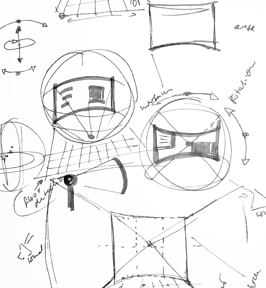
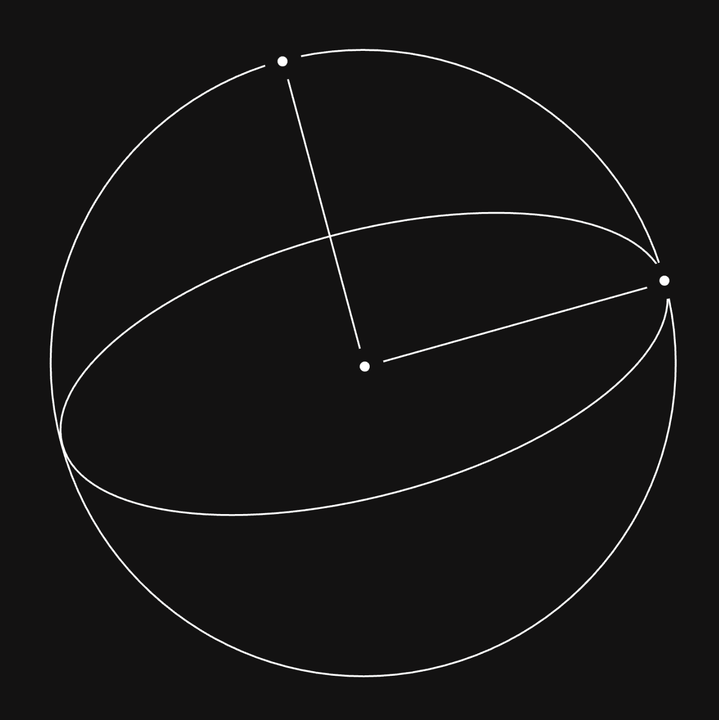
Design Process of 3D Interfaces in VR/AR
Process of Understanding AI
Design Process of 3D Interfaces in VR/AR
Process of Understanding AI
Design Process of 3D Interfaces in VR/AR
Process of Understanding AI
This wasn’t just about creating more icons. It started with understanding where design was headed and what professionals really needed.
01
Designers wanted consistency without losing depth
02
Marketing teams needed to visualize abstract concepts quickly and accurately
03
Brand managers were looking for assets that looked modern but wouldn’t date fast
04
There wasn’t a single source for intelligent, specialized icons covering AI, VR/AR, sustainability and business innovation
The opportunity was clear: create an iconset that bridges the gap between simple symbols and detailed illustrations while keeping pace with new technology.
Our Approach
Focused Clarity: Designing with Purpose
Our Approach
Focused Clarity: Designing with Purpose
Our Approach
Focused Clarity: Designing with Purpose
Icons in Use
Icons in Use
Icons in Use
Every icon in Nucleus was designed with intention. We didn’t just aim to produce hundreds of symbols but to design accurate visuals for complex concepts.
Every icon in Nucleus was designed with intention. We didn’t just aim to produce hundreds of symbols but to design accurate visuals for complex concepts.
Every icon in Nucleus was designed with intention. We didn’t just aim to produce hundreds of symbols but to design accurate visuals for complex concepts.
Our Process
Defining the Style
Our Process
Defining the Style
Our Process
Defining the Style
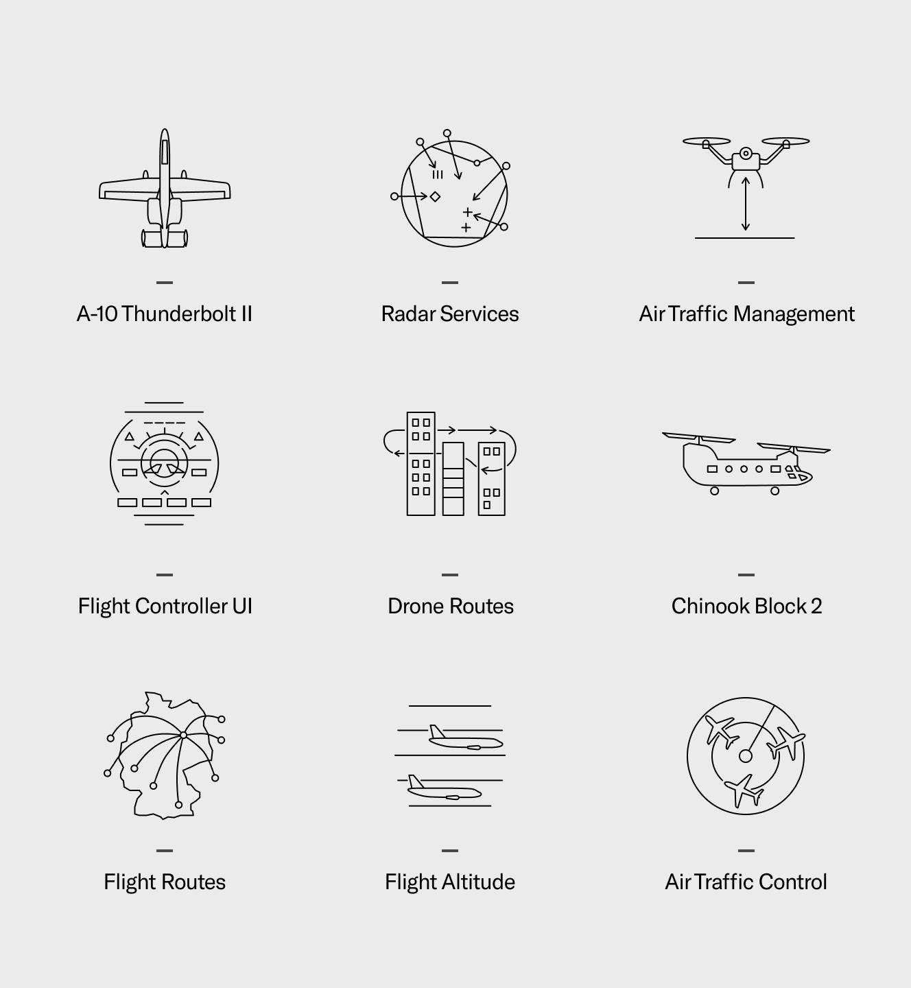
Binary - Aerospace & Defense
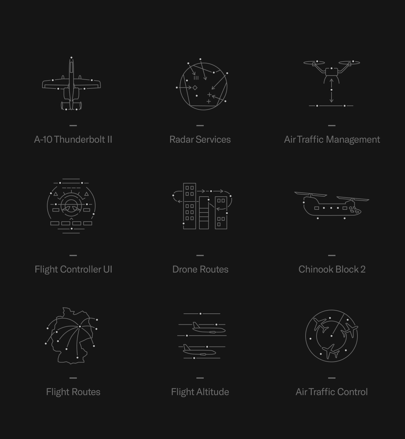
Dark Duotone - Aerospace & Defense
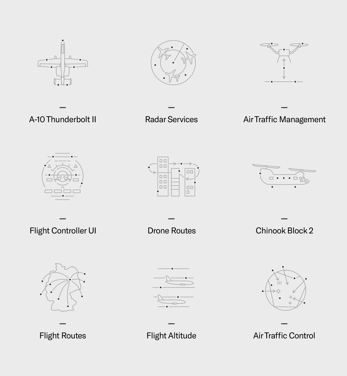
Light Duotone - Aerospace & Defense
We developed a distinctive visual language that balances precision with approachability. Clean lines, smart use of space and careful proportions make the icons work at any size from mobile screens to large presentations. The style grew into three versions: Binary for minimal use, and two Duotone variants for more visual depth. Each version shares the same structure so designers can mix them without losing consistency.
We developed a distinctive visual language that balances precision with approachability. Clean lines, smart use of space and careful proportions make the icons work at any size from mobile screens to large presentations. The style grew into three versions: Binary for minimal use, and two Duotone variants for more visual depth. Each version shares the same structure so designers can mix them without losing consistency.
We developed a distinctive visual language that balances precision with approachability. Clean lines, smart use of space and careful proportions make the icons work at any size from mobile screens to large presentations. The style grew into three versions: Binary for minimal use, and two Duotone variants for more visual depth. Each version shares the same structure so designers can mix them without losing consistency.
Our Process
Research-Driven Precision
Our Process
Research-Driven Precision
Our Process
Research-Driven Precision
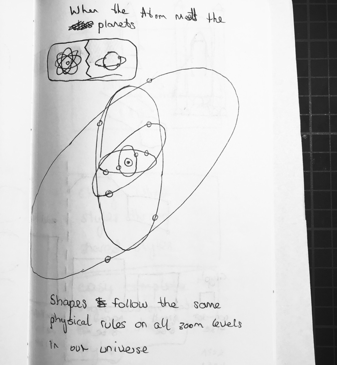
Abstraction
Visual and Conceptual Inspiration
Abstraction
Visual and Conceptual Inspiration
Abstraction
Visual and Conceptual Inspiration
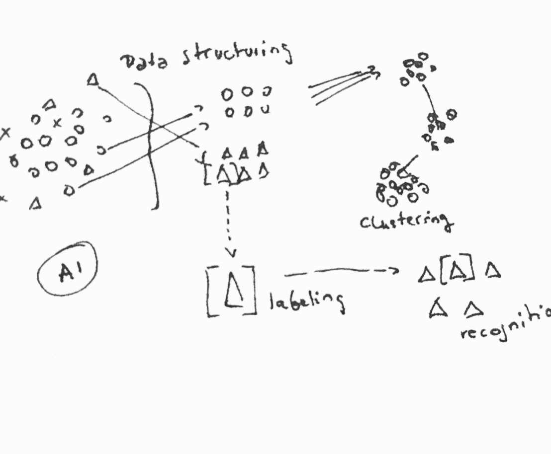
Before designing icons for ideas like “conversational AI” or “spatial computing,” we studied what those terms meant and how the technologies worked. Every icon needed to express the core idea, not just look technical. We applied the same process to business essentials. Sales and marketing icons were based on real workflows, not generic symbols. Design research icons took even more work, translating methods like “affinity mapping” into visuals that experts would recognize. We spent time checking terminology and making sure each icon accurately matched its concept.
Before designing icons for ideas like “conversational AI” or “spatial computing,” we studied what those terms meant and how the technologies worked. Every icon needed to express the core idea, not just look technical. We applied the same process to business essentials. Sales and marketing icons were based on real workflows, not generic symbols. Design research icons took even more work, translating methods like “affinity mapping” into visuals that experts would recognize. We spent time checking terminology and making sure each icon accurately matched its concept.
Before designing icons for ideas like “conversational AI” or “spatial computing,” we studied what those terms meant and how the technologies worked. Every icon needed to express the core idea, not just look technical. We applied the same process to business essentials. Sales and marketing icons were based on real workflows, not generic symbols. Design research icons took even more work, translating methods like “affinity mapping” into visuals that experts would recognize. We spent time checking terminology and making sure each icon accurately matched its concept.
Our Process
Building a Product, Not Just a Set
Our Process
Building a Product, Not Just a Set
Our Process
Building a Product, Not Just a Set
Icon Searchability with Keywords
Icon Searchability with Keywords
Icon Searchability with Keywords
We launched in 2017 with 125 carefully crafted icons. But Nucleus was never meant to be finished. It keeps growing with new icons based on user requests and industry changes. What started as a small set is now more than 1,000 icons with consistent style. By updating regularly, Nucleus became more than a product. It turned into a living design system that evolves with technology.
We launched in 2017 with 125 carefully crafted icons. But Nucleus was never meant to be finished. It keeps growing with new icons based on user requests and industry changes. What started as a small set is now more than 1,000 icons with consistent style. By updating regularly, Nucleus became more than a product. It turned into a living design system that evolves with technology.
We launched in 2017 with 125 carefully crafted icons. But Nucleus was never meant to be finished. It keeps growing with new icons based on user requests and industry changes. What started as a small set is now more than 1,000 icons with consistent style. By updating regularly, Nucleus became more than a product. It turned into a living design system that evolves with technology.
The Outcome
Building a Living System
The Outcome
Building a Living System
The Outcome
Building a Living System
nucleusicons.com
nucleusicons.com
nucleusicons.com
Nucleus Icons continues to thrive. More than 500 sets have been sold to designers, marketers and brand managers who needed a visual language they can trust. The work stands out, because it solves a real problem: making complex terminology easier to see and understand. The project earned an Honorable Mention from Awwwards in 2018 and has ranked among the top five icon sets on UI8.net. But the best recognition comes from seeing the icons used in actual projects: in decks, interfaces and brand materials for companies working on the edge of tech, research and design. What began as a way to fill a gap, became the foundation for something bigger. The visual system Daniel and Özden developed for Nucleus Icons, with its clarity and precision, laid the foundation for what became Keen Aspect. Daniel's vision and foundational work continue to shape the approach, influencing how we think about making complex ideas accessible through design. In many ways, Nucleus Icons was where it all began. Today, Nucleus Icons is still growing, now with over 1,000 icons across three styles, continuously updated with new motifs as technology evolves. It remains available at nucleusicons.com, proving that thoughtful design stands the test of time.
Nucleus Icons continues to thrive. More than 500 sets have been sold to designers, marketers and brand managers who needed a visual language they can trust. The work stands out, because it solves a real problem: making complex terminology easier to see and understand. The project earned an Honorable Mention from Awwwards in 2018 and has ranked among the top five icon sets on UI8.net. But the best recognition comes from seeing the icons used in actual projects: in decks, interfaces and brand materials for companies working on the edge of tech, research and design. What began as a way to fill a gap, became the foundation for something bigger. The visual system Daniel and Özden developed for Nucleus Icons, with its clarity and precision, laid the foundation for what became Keen Aspect. Daniel's vision and foundational work continue to shape the approach, influencing how we think about making complex ideas accessible through design. In many ways, Nucleus Icons was where it all began. Today, Nucleus Icons is still growing, now with over 1,000 icons across three styles, continuously updated with new motifs as technology evolves. It remains available at nucleusicons.com, proving that thoughtful design stands the test of time.
Nucleus Icons continues to thrive. More than 500 sets have been sold to designers, marketers and brand managers who needed a visual language they can trust. The work stands out, because it solves a real problem: making complex terminology easier to see and understand. The project earned an Honorable Mention from Awwwards in 2018 and has ranked among the top five icon sets on UI8.net. But the best recognition comes from seeing the icons used in actual projects: in decks, interfaces and brand materials for companies working on the edge of tech, research and design. What began as a way to fill a gap, became the foundation for something bigger. The visual system Daniel and Özden developed for Nucleus Icons, with its clarity and precision, laid the foundation for what became Keen Aspect. Daniel's vision and foundational work continue to shape the approach, influencing how we think about making complex ideas accessible through design. In many ways, Nucleus Icons was where it all began. Today, Nucleus Icons is still growing, now with over 1,000 icons across three styles, continuously updated with new motifs as technology evolves. It remains available at nucleusicons.com, proving that thoughtful design stands the test of time.
Case Studies
More Case Studies to Explore
Case Studies
More Case Studies to Explore
Case Studies
More Case Studies to Explore
Contact